Monday
Feb112013

Brighter | 1

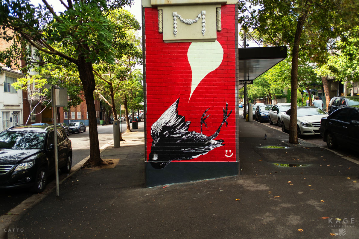
text & photography by Robert Catto


When I first came to Australia fifteen years ago, it was partly because of what a friend at school in Canada had said to me: “I don’t know how to describe it, but the colours are brighter there.”

It’s true, certainly - the sun here does seem to cut more, to shine harder; but also the birds, plants and flowers that have grown here are more colourful than those in my home land of pine trees, pink granite and lakes.

And it seemed to me that the people had taken that on - had made their cities, cars and houses more colourful. Themselves, too.

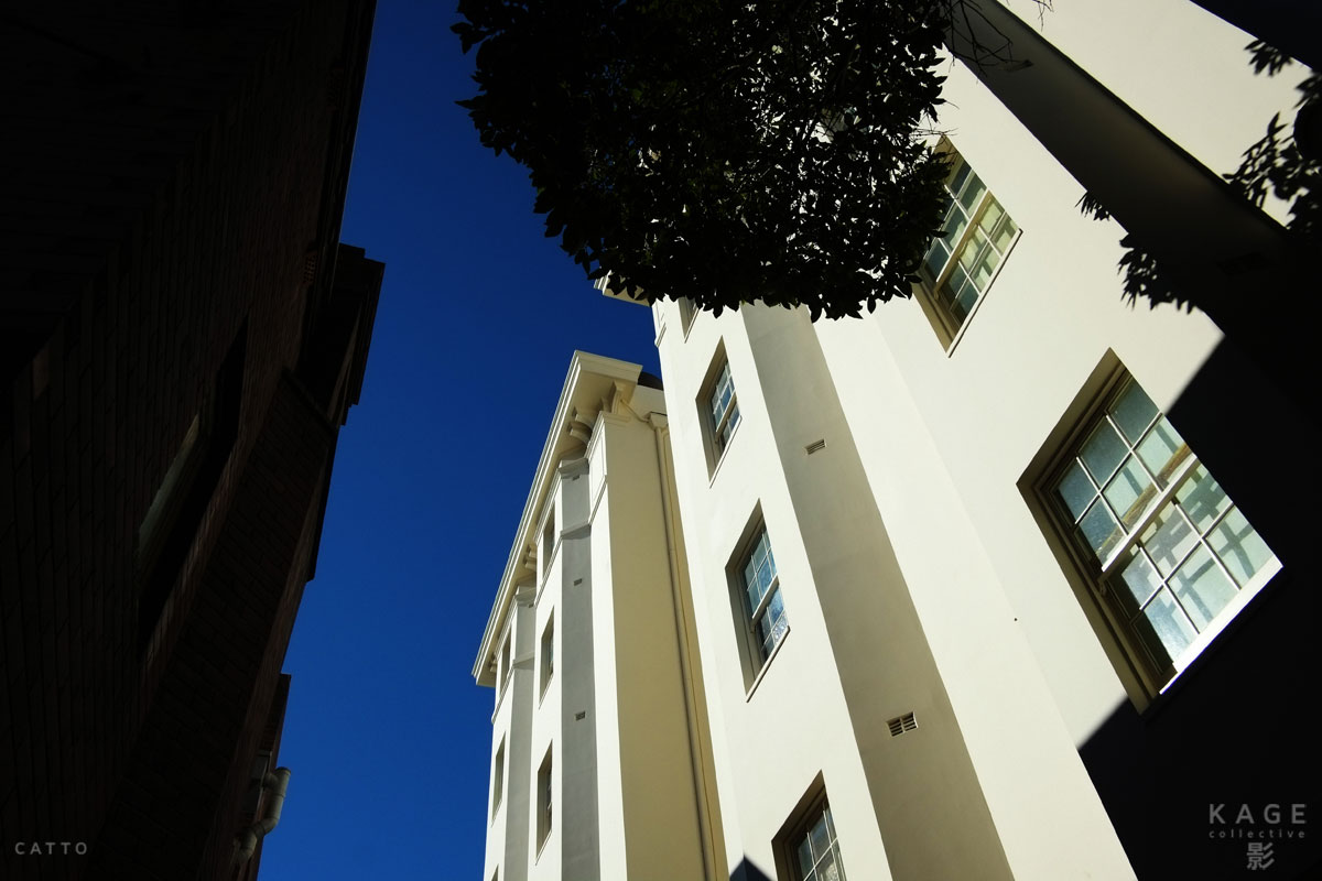
Moving back here from New Zealand, after fifteen years in a country whose national colour is black, I’m reminded again why I felt that way. The light itself is similar to New Zealand’s; but the brightness is somehow, to me, Australian.

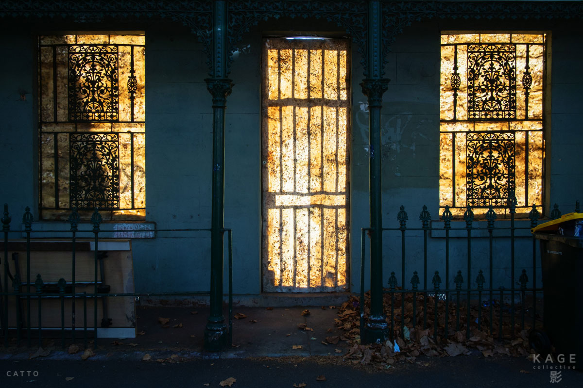
This is part one of what will be an ongoing project for me, as I test my friend’s statement. Some chapters may push back against the theory, others will propel it further - but I’ll be interested to see which side wins!


PrintView Printer Friendly Version

EmailEmail Article to Friend

Reader Comments (4)

Nice series indeed and dare I say, colourful :) no seriously though, you have compiled some beautiful images and the reds, yellows and blues really pop here on my iPad retina screen.

February 14, 2013 | Unregistered CommenterMorten Byskov

Thanks, Morten - and sorry not to reply sooner, I only just spotted your note! Glad the images look good on the iPad as well, I think I must have checked them on every screen I could find, but you never know...

The funny thing is the building in the fifth image has faded so much since I took that one, it hardly looks 'brighter' at all, any more! Possibly I should do a follow up on 'faded glory', and see how these places change over time...
R!

February 26, 2013 | Unregistered CommenterRobert Catto

Great set of images. Colour photos is omething I can't do without. Believe me, I love B&W photography and I have tried numerous times to process to B&W only. But colour is so much harder to get right, and when done right.. it's best!

March 13, 2013 | Unregistered CommenterRobert-Paul Jansen

Thanks, Robert-Paul! (I was sure I posted a reply months ago when I first read your note, but I don't see it now.) Really glad you liked it, and hope to have another chapter sometime soon...

May 8, 2013 | Registered CommenterCatto

PostPost a New Comment

Enter your information below to add a new comment.

My response is on my own website »
Author Email (optional):
Author URL (optional):
Post:
 
Some HTML allowed: <a href="" title=""> <abbr title=""> <acronym title=""> <b> <blockquote cite=""> <code> <em> <i> <strike> <strong>
« Gods & Machinery | Main | A Mute Reminder »